Estimated reading time: 6 minutes
Many organizations use quality tools to help monitor and manage their quality initiatives.
There are several types of tools that can be used. However, there are seven management tools for quality control that are the most common.
Different tools are used for different problem-solving opportunities, and many of the tools can be used in different ways.
The trick is to become familiar and comfortable with all of these quality tools so you can pull the appropriate one out of your toolbox when there is a problem that needs to be solved.
7 Management Tools For Quality Control
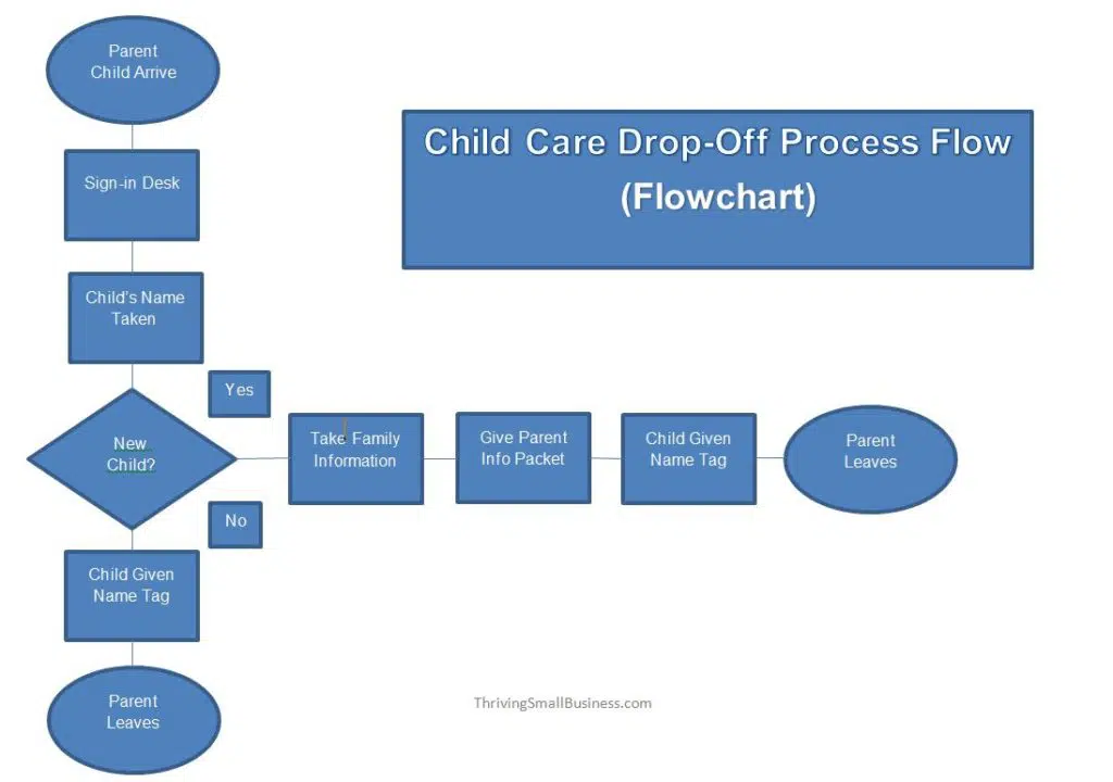
1. Flowchart
Most of us are familiar with flowcharts. You have seen flowcharts of reporting relationships in organizational structures.
Flowcharts are also used to document work process flows.

This tool is used when trying to determine where the bottlenecks or breakdowns are in work processes.
Flowcharting the steps of a process provides a picture of what the process looks like and can shed light on issues within the process.
Flowcharts are also used to show changes in a process when improvements are made or to show a new workflow process.
This example provides a picture so those checking children in will know the steps each takes depending on whether it is their first time or a child who has been there before.
Example Flowchart
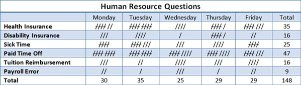
2. Check Sheet
A check sheet is a basic quality tool that is used to collect data. A check sheet might be used to track the number of times a certain incident happens.
As an example, a human resource department may track the number of questions by employees per category per day.
In this particular check sheet, the tool shows the total number of questions received by the human resources department.
This information helps that department identify opportunities to proactively share information with employees in an effort to reduce the number of questions asked.
Example Check Sheet
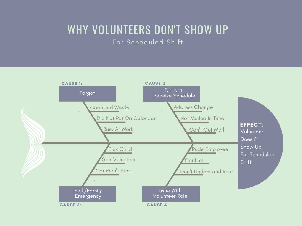
3. Cause and Effect (fishbone) Diagram
A cause and effect diagram, also known as a fish-bone diagram, shows the many possible causes of a problem.
To use this tool, you need to first identify the problem you are trying to solve and simply write it in the box (head of the fish) to the right.
Next, you will list the major causes of the problem on the spine of the fish.
Causes are typically separated into categories of people, processes, materials, and equipment.
Causes are then identified through brainstorming with a group familiar with the problem.
Once all of the possible causes are identified, they can be used to develop an improvement plan to help resolve the identified problem.
Example Cause and Effect (Fish Bone) Diagram
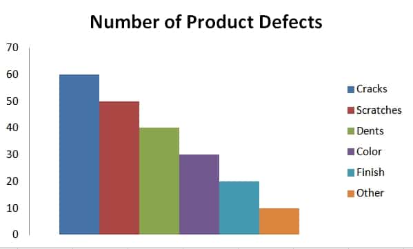
4. Pareto Chart
A Pareto chart is a bar graph of data showing the largest number of frequencies to the smallest.
In this example, we are looking at the number of product defects in each of the listed categories.
When you look at the number of defects from the largest to the smallest occurrences, it is easy to see how to prioritize improvement efforts.
The most significant problems stand out and can be targeted first.
Example Pareto Chart
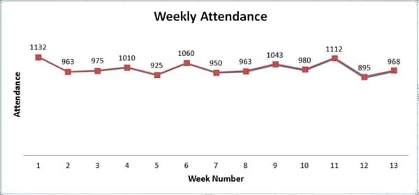
5. Control Charts
Control charts or run charts are used to plot data points over time and give a picture of the movement of that data.
These charts demonstrate when data is consistent or when there are high or low outliers in the occurrences of data.
It focuses on monitoring performance over time by looking at the variation in data points.
And it distinguishes between common cause and special cause variations. The Dow Jones Industrial Average is a good example of a control chart.
Example Control (Run) Charts
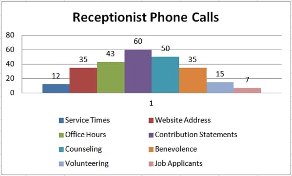
6. Histograms
Histograms are bar chart pictures of data that show patterns that fall within typical process conditions.
Changes in a process should trigger the new collection of data.
A minimum of 50-75 data points should be gathered to ensure an adequate number of data points have been collected.
The patterns that are detected demonstrate an analysis that helps understand variation.
In this example, it shows that the receptionist received the most phone calls about contribution statements for that period.
Example Histogram
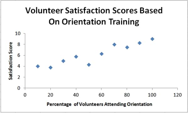
7. Scatter Diagrams
Scatter diagrams are graphs that show the relationship between variables. Variables often represent possible causes and effects.
As an example, a scatter diagram might show the relationship between how satisfied volunteers are that attend orientation training.
The diagram shows the relationship between volunteer satisfaction scores and volunteer orientation training.
Example Scatter Diagram
Each of these quality tools has unique advantages for certain situations. And, not all tools are used for all problem-solving.
Once a tool is learned, it can be adapted to different problem-solving opportunities.
Additionally, as with anything else, using tools properly takes practice and experience. Simply start using each of the tools, and over time, you will become proficient and a great problem solver!
What problems does your organization have that could benefit from one of these tools?